The Importance of Responsive Design: Why Your Website Needs to Look Great on All Devices
Posted by rainstream007 at 19 Jun 2023
Responsive design is crucial for modern websites because it ensures that your site looks and functions flawlessly across a wide range of devices, including desktop computers, laptops, tablets, and smartphones. In today’s digital landscape, where users access websites from various devices with different screen sizes and resolutions, a responsive design is no longer optional but necessary. Here are several reasons why your website needs to look great on all devices:
Improved User Experience: Responsive design provides a consistent and optimized user experience regardless of the device being used. Users expect websites to load quickly and be easy to navigate, regardless of whether they’re on a large desktop monitor or a small smartphone screen. By adapting your site’s layout and content to fit different screens, you can ensure a positive user experience and keep visitors engaged.
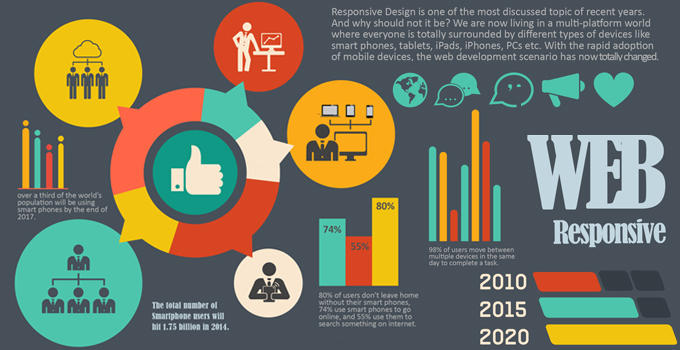
Increased Mobile Usage: Mobile devices have become the primary means of accessing the internet for many people. According to statistics, the majority of internet traffic now comes from mobile devices. If your website is not optimized for mobile viewing, you risk losing a significant portion of your potential audience. Responsive design allows your site to adapt seamlessly to different screen sizes, making it accessible and visually appealing to mobile users.
Better Search Engine Rankings: Search engines like Google prioritize mobile-friendly websites in their search results. Google has even implemented mobile-first indexing, meaning it primarily uses the mobile version of a website for indexing and ranking purposes. Having a responsive design can positively impact your search engine rankings and make it easier for users to find your site in search results.
Cost and Time Efficiency: In the past, businesses used to create separate versions of their websites for desktop and mobile devices. However, maintaining multiple versions can be time-consuming and expensive. With a responsive design, you only need to develop and manage one website, reducing the development and maintenance costs. This approach also saves time as updates and changes can be made once and automatically applied across all devices.
Social Sharing and Link Building: Responsive design makes it easier for users to share your website’s content on social media platforms. When shared links are accessed from mobile devices, a responsive design ensures that the content is displayed correctly, improving the user experience and increasing the likelihood of engagement and subsequent link building.
Future-Proofing: Technology is constantly evolving, and new devices with varying screen sizes and resolutions will continue to emerge. By implementing a responsive design, you future-proof your website, ensuring that it remains compatible and accessible as new devices enter the market. This adaptability helps your site stay relevant and functional, regardless of technological advancements.
In conclusion, responsive design is essential for any website that wants to provide an optimal user experience, reach a broader audience, and maintain a competitive edge in the digital landscape. It ensures that your website looks great and functions seamlessly on all devices, leading to increased user satisfaction, improved search engine rankings, and better overall performance.